ABOUT
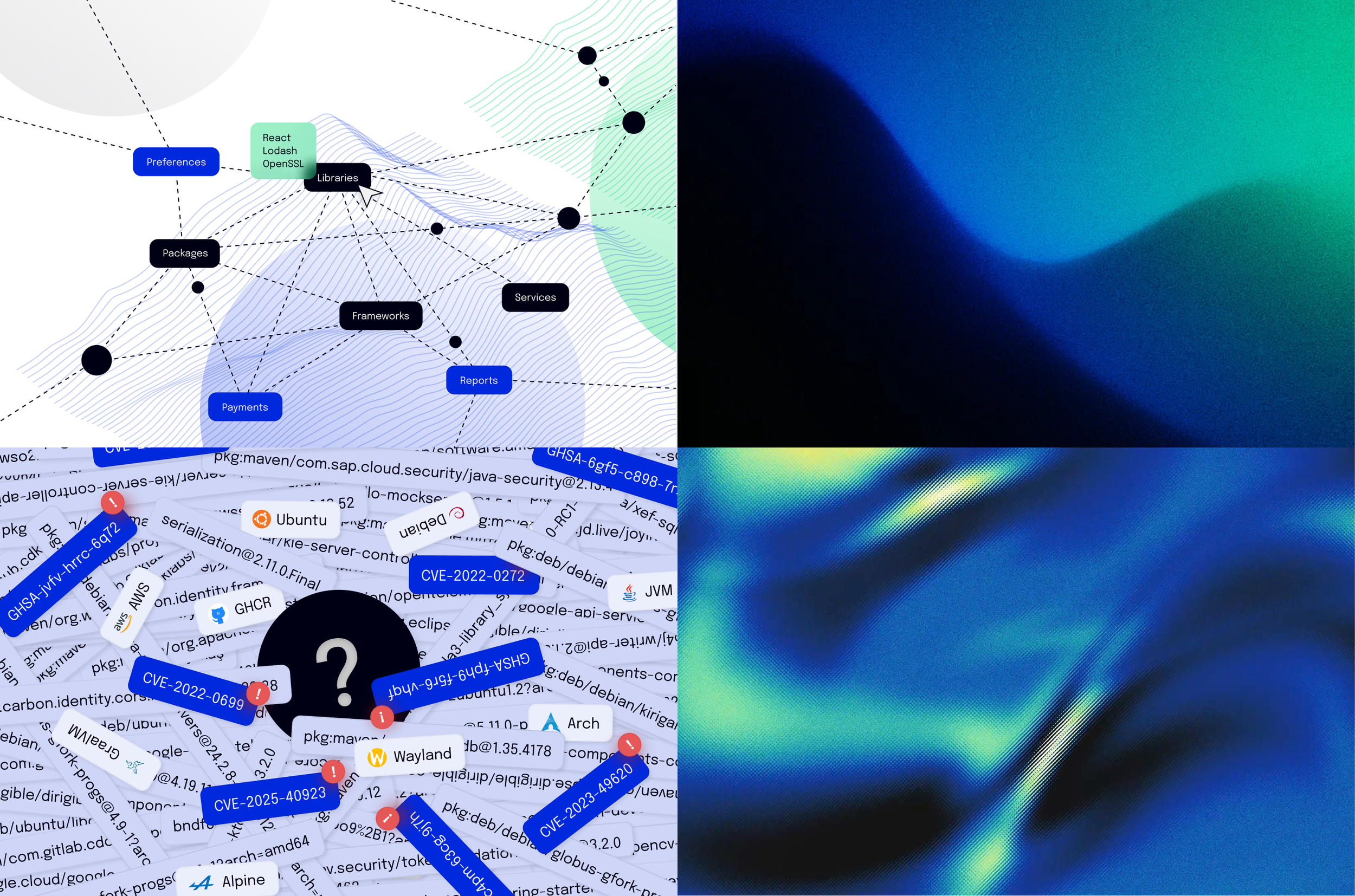
Spice Labs uses cryptographic fingerprinting to map software stacks, giving organizations data-driven visibility into technical debt, security risks, and legacy modernization.
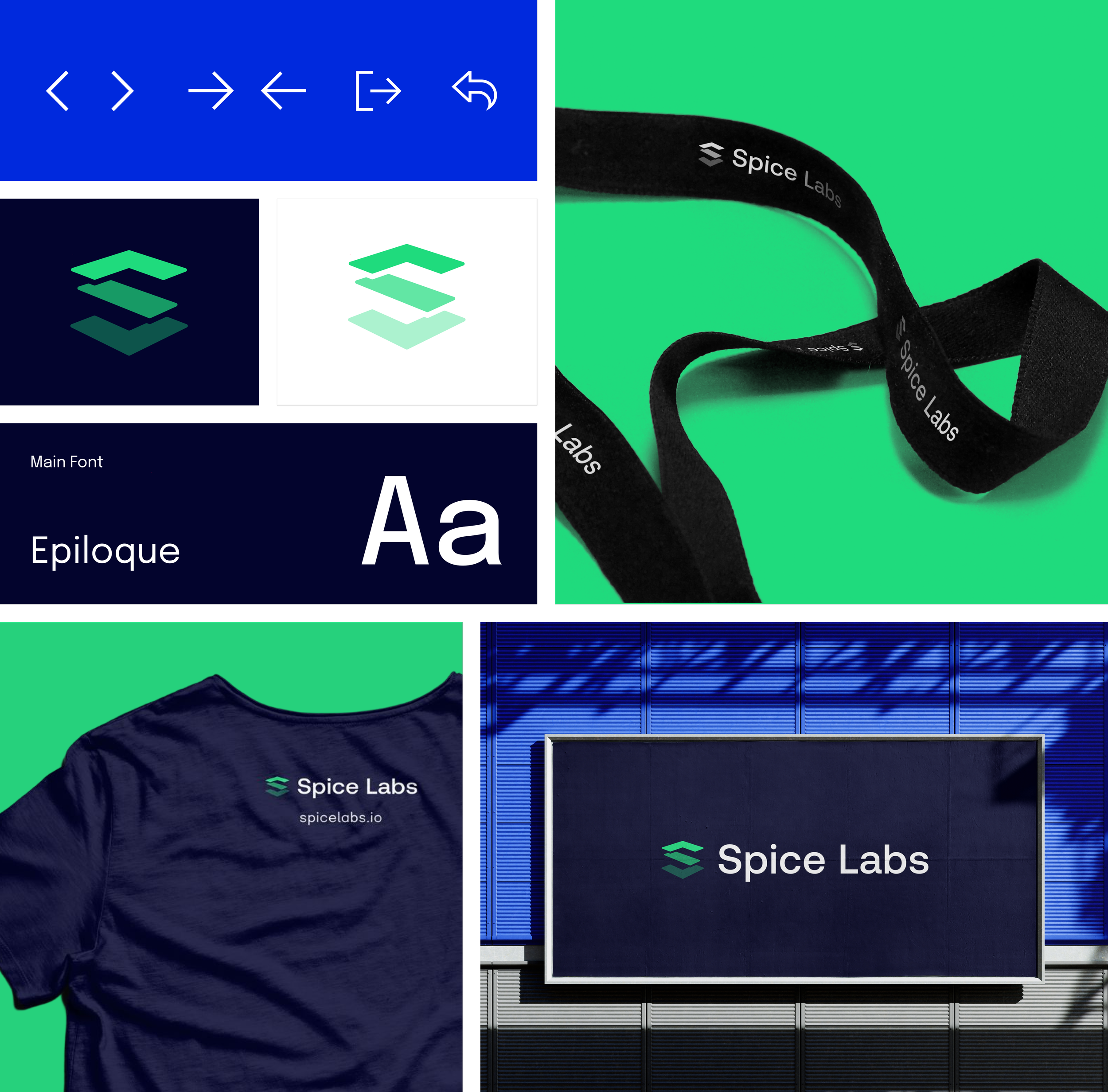
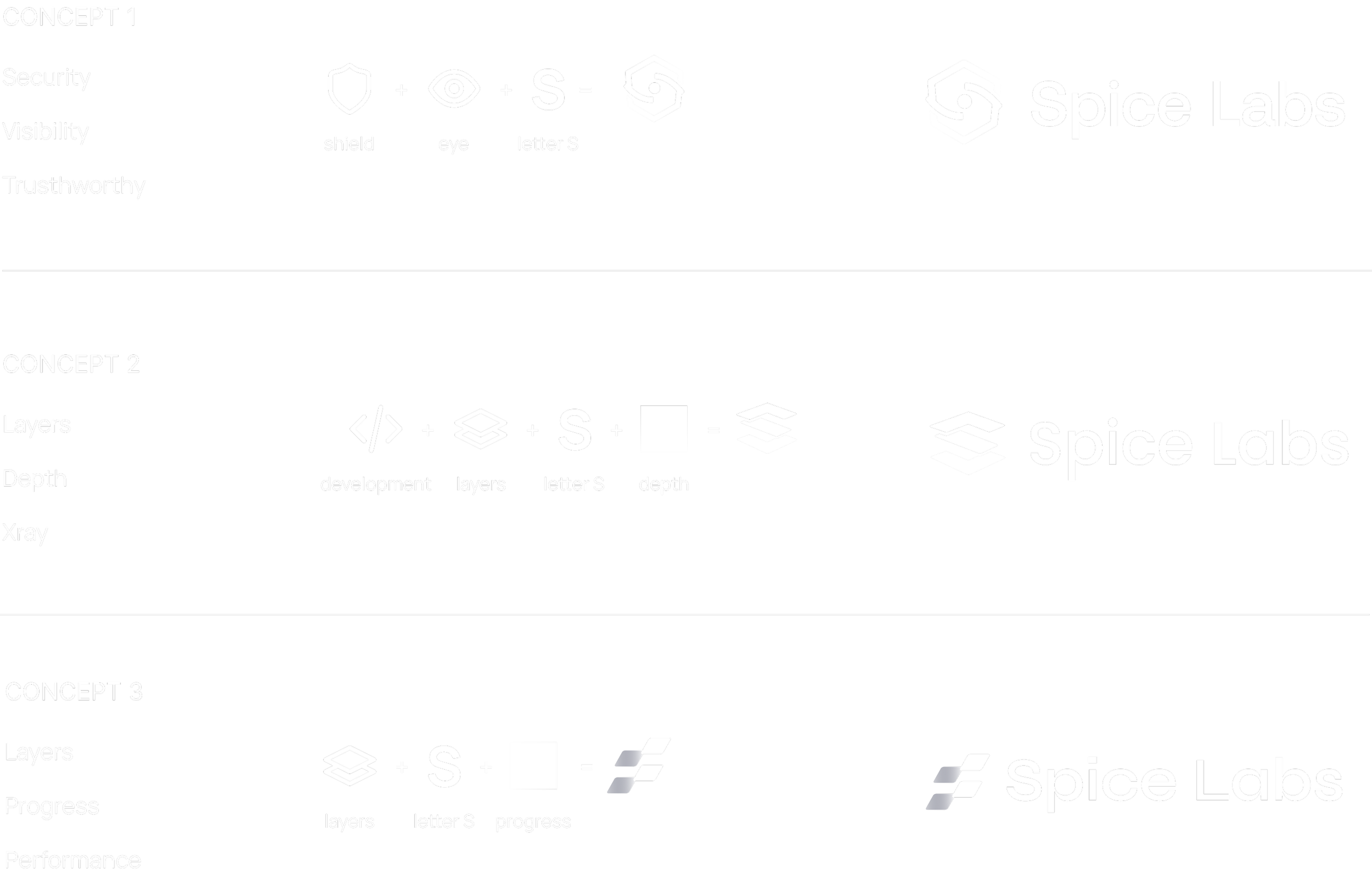
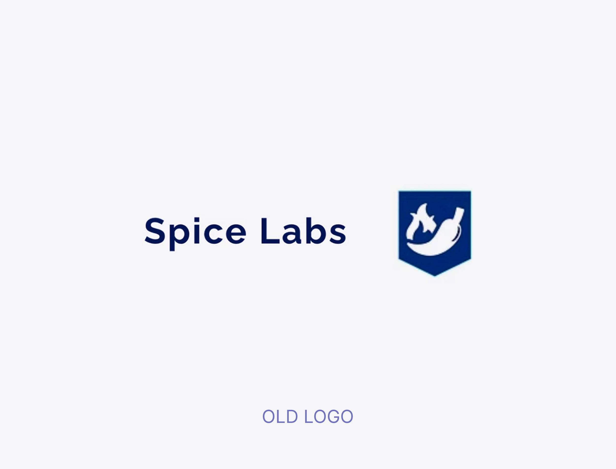
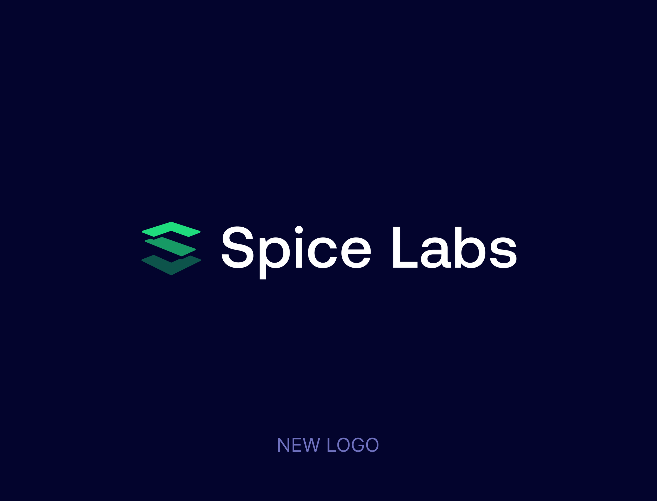
We recently partnered with Spice Labs to refresh their brand identity and create a logo that reflects their mission to bring clarity and depth to complex systems. The final mark blends the development symbol </>, layered structures, and the letter S, forming a visual language that feels both technical and dynamic.
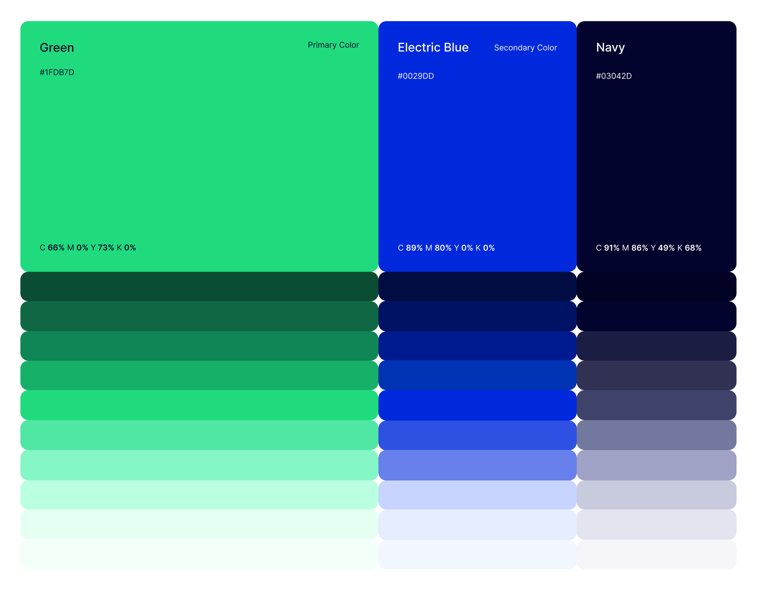
Color played an essential role in capturing the brand’s character:
Green for growth and innovation
Blue for trust and intelligence
Navy for depth and contrast
The result is a bold and modern identity that reflects how Spice Labs brings clarity and confidence to complex systems.
Brand Design
Created By
Studio Pinto
Client
Spice Labs
Year
2025

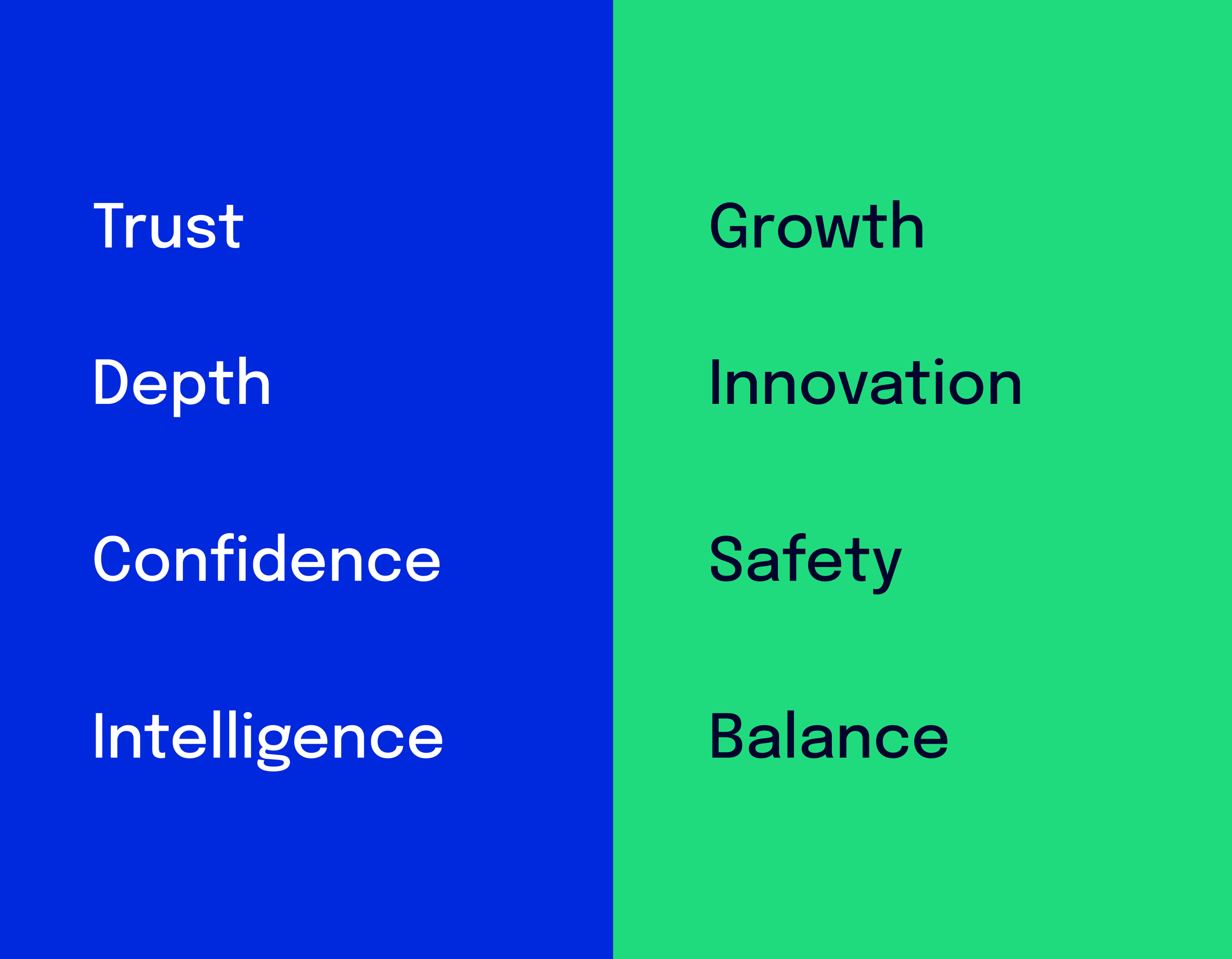
Brand values are the foundational principles that guide how Spice Labs thinks, behaves, and grows.
BRAND VALUES

ABOUT

TYPOGRAPHY & STYLE GUIDE


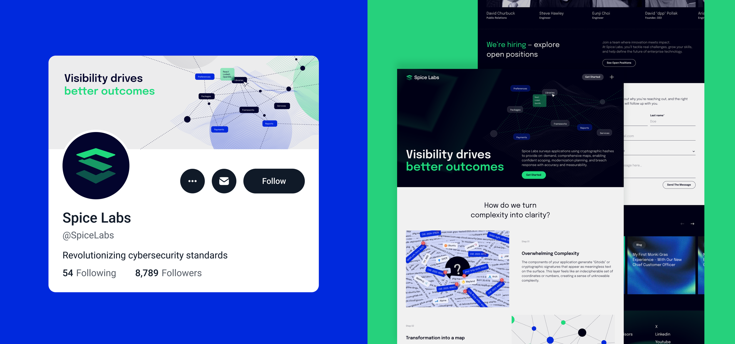
IMAGERY
The 2D illustrations help explain complex relationships — such as dependencies, flows, and structures — in a clear, modular way.
Imagery is never purely decorative — it serves as a conceptual lens into the technology we build.